Alley has a new look for 2018 and beyond!
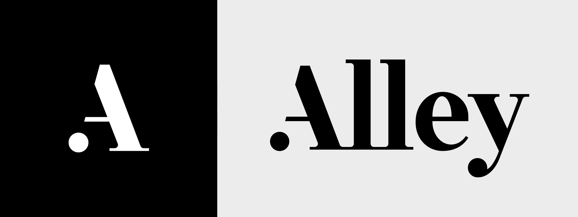
We’ve updated our branding and our site to make it even clearer who we are, what we do, and how we do it. When our design and development teams tackled this work, it was with the same passion and vigor we bring to client projects, so we’re eager to share it with the world. As with any new branding challenge, our goal was to extract the most objective feedback possible from company stakeholders, so we could more accurately develop a look and feel that’s truly unique to the brand.
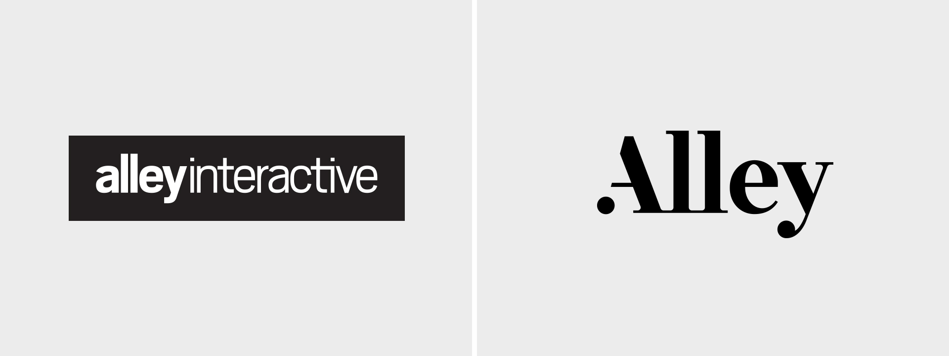
Using the same methods that we apply to user research when we create concepts for our clients, we personified our brand around its authentic attributes. These attributes gave us a strong point of reference when giving feedback and iterating on our work.
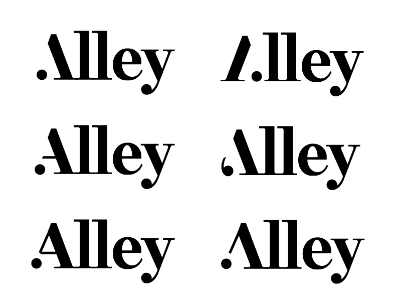
Crafting our new identity also reinforced the value of a collaborative and iterative design process. The team shared sketches early and often with Alley’s leadership, as well as each other, to collect valuable feedback that shaped the final mark you see today. “As the design lead, it’s the challenge of balancing your gut and knowledge of best practices with criticism and new suggestions from peers,” notes Christa Field, our creative director. “Each new iteration adapted into the design was measured against our key persona of Alley. Through rounds of this process, we developed a mark that is unique and authentic to Alley.”
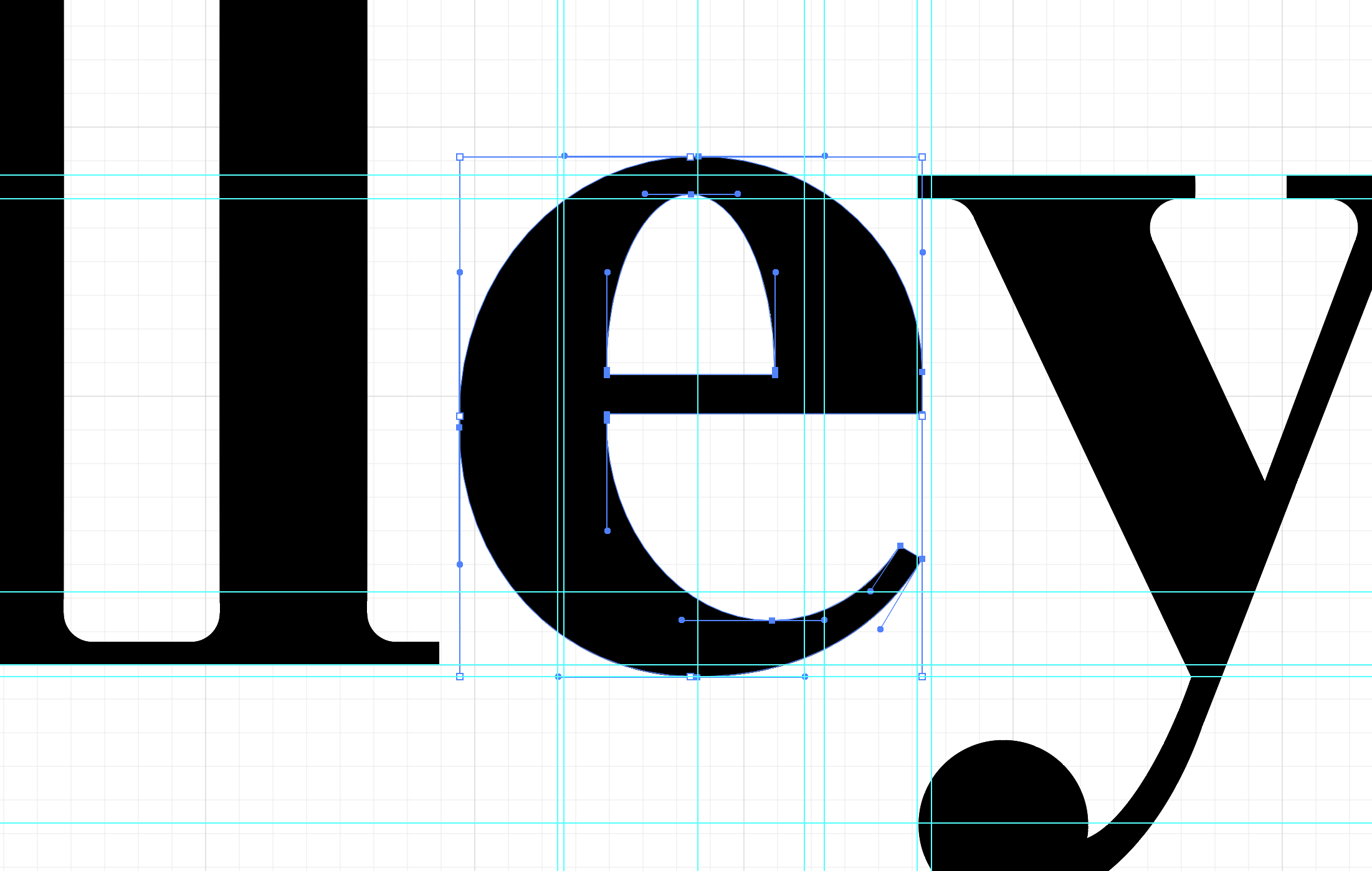
Once the visual aspects of our identity were set, we turned to rethinking our tagline. Our design, editorial, and marketing teams came together with the partners for a collaborative brainstorming session, during which we discussed Alley’s core values, skills, and strengths. As was key throughout our visual branding work, we needed to make sure the tagline we chose felt authentic to Alley’s culture and mission. Ultimately, one of Director of User Experience Susan Finkelpearl’s suggestions resonated best with the group: “Let’s do launch.” The phrase captures Alley’s conversational sense of humor and project-driven sense of purpose in a bold call to action.
In conjunction with developing our new branding, we also redesigned our website. Along with our philosophy, values, and our past work, we also wanted to describe our services in greater depth, to show the breadth of our ongoing projects, and give users an easy way to contact us. We also wanted our new site’s navigation to give visitors exactly the information they need and make it as simple as possible to start a conversation.

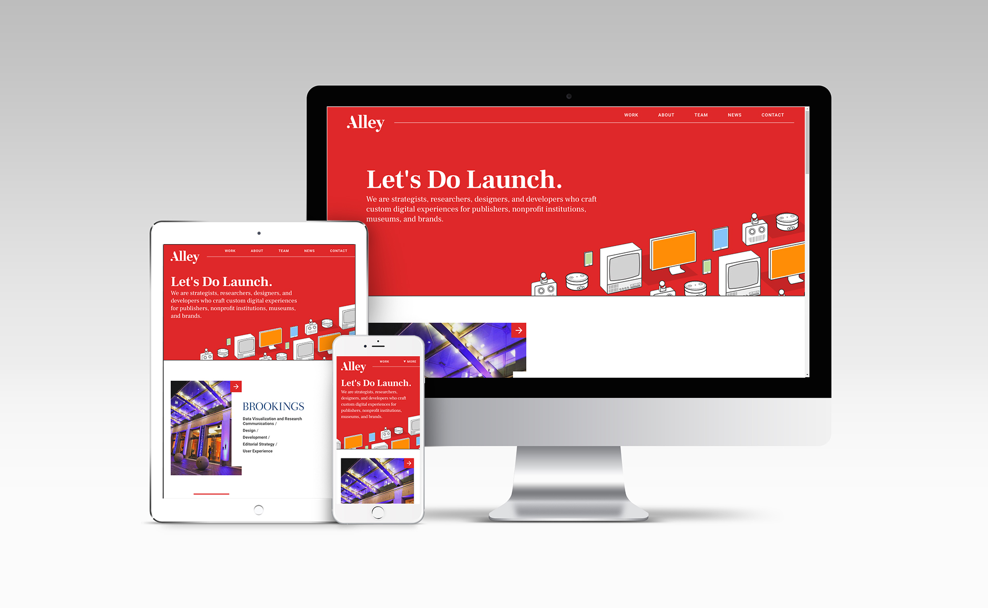
Through all of these changes to our website and branding, we remain dedicated to the same values of quality, accountability, and transparency. We embrace kaizen, or continuous improvement, and changes like these are just another step in the right direction. We’re excited to see where this takes us, and we hope you are too.
If you have any questions, please feel free to reach out using our all new contact form—let’s do launch!
