A new chapter for Hachette Book Group
Our role

Hachette Book Group (HBG), one of the big five publishing companies, is comprised of numerous esteemed imprints that cover an array of genres and age groups. HBG publishes more than 1,000 books each year. Their authors regularly land on the New York Times bestseller list and earn prestigious accolades for their work.
Challenges
Hachette sought to transform their site by breathing new life into the design and by increasing its utility for users on two fronts. First, they wanted to present titles from all of their publishing groups and imprints together as one comprehensive catalog for bookstore and publishing professionals to peruse. Second, they wanted to integrate a top-notch e-commerce platform to deliver a seamless shopping experience. The objectives were clear: showcase a diverse range of products, encourage browsing, discovery, and purchases while also optimizing the site for mobile usage.
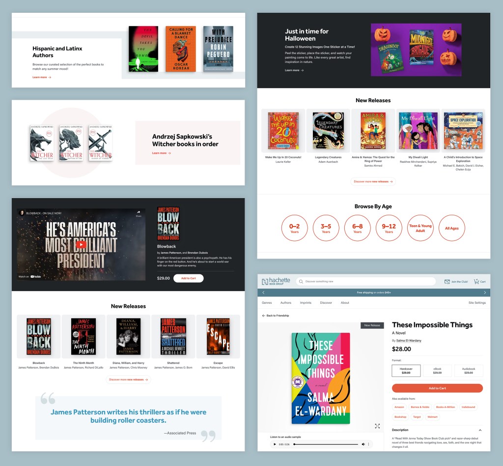
The site’s staid design was burdened with excessive use of image carousels. Originally introduced to highlight seasonal offerings, new book releases, and authors, the carousels were thought to provide more information to users in a limited space. User research, however, revealed they were often overlooked as users swiftly scanned the site. Since carousels require multiple high-resolution files and complex code to facilitate interactive effects, they were hindering performance by negatively impacting Core Web Vitals. Users were not only missing valuable information, they were experiencing slower load times and a cluttered user interface.
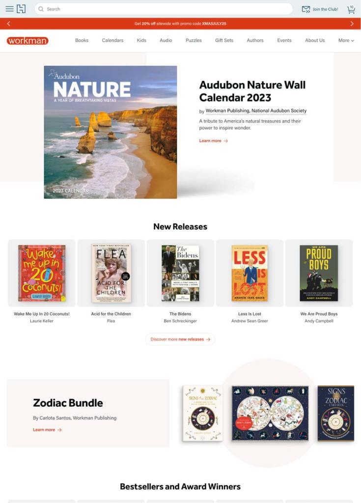
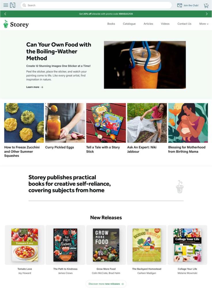
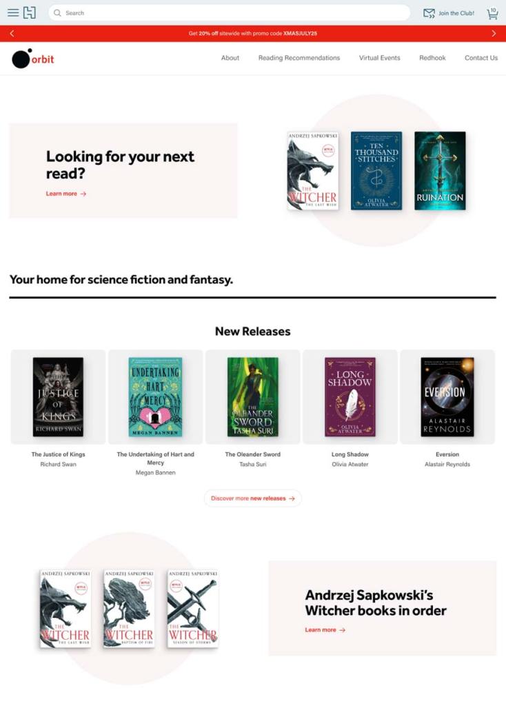
In addition to these challenges, the Hachette team faced significant workflow issues. With dozens of editors managing their respective imprint sites, achieving a cohesive and coordinated workflow was a daunting task. HBG needed a design system that could preserve the identity of each imprint while promoting a unified look that connected them to the broader Hachette family. The site’s overall design had an impersonal aesthetic, characterized by a gray color scheme and all-caps headers. Meanwhile, the grid patterns used to present numerous book cover images throughout the site were dense and cluttered, adding considerable visual noise to the site.
Working with Alley on the redesign of our website was a game changer for us – in terms of the visual cohesiveness, user experience, site performance, and, most importantly, in how the site now aligns with our strategic goals. Alley was a great partner throughout the project, and really brought a 360 degree commitment to the job. They didn’t just develop a better Website, they delivered a solution.
Wibke Grütjen, Vice President and Chief Marketing Officer, Hachette Book Group

Solutions
Before we embark on any design or development project, we seek to gain a thorough understanding of the site’s end users — both on the front end (consumers) and the back end (internal editorial and marketing team members). In Hachette’s case, it was crucial for us to grasp their internal requirements, since there would be many editors managing many imprint sites. We kicked off our research with a series of roundtable discussions and surveys to better understand Hachette’s identity, competitive positioning, areas for improvement, and project priorities. We inventoried their existing content management system (CMS) to assess which styles and templates were most widely used, eliminate unnecessary features, and identify opportunities to simplify and replicate patterns. These findings informed a block-based design system that now empowers editors to uphold the HBG brand across various publishing sites while meeting the unique needs of their imprint’s product mix and audience-engagement strategies.
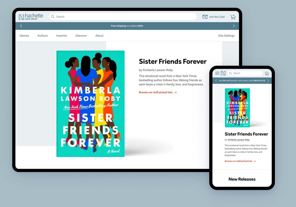
Our design system aimed to create a more welcoming aesthetic and bolster the Hachette brand. We replaced the site’s gray wash with a sheer blue from HBG’s color palette, switched headlines from all caps to sentence case, and extended the brand’s presence within the design by integrating the bold 90° angles and line breaks from Hachette’s emblematic “H” logo.
We designed reusable patterns that unite HBG’s collective of publishers while also providing customization options that give editors creative freedom within overall brand standards. These patterns act as a foundation that will allow HBG editors to continually refine and improve their design systems as their needs evolve.
We identified opportunities to further streamline Hachette’s workflows and enhance users’ shopping experience throughout the project. During our discovery, we learned that site editors were spending a lot of time hand-curating book lists. In response, we created dynamic methods to populate lists. This improvement gives time back to editors and further promotes browsing, discovery, and additional purchases across the site.
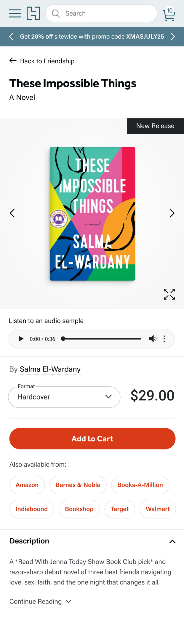
Throughout the project, we prioritized accessibility and a mobile-first experience. We eliminated intrusive auto-play carousels and integrated intuitive horizontal scroll features to showcase book collections, which provide a more engaging and intuitive way for users to explore content. We also reduced visual noise with uniform book cover image sizes and tiles that make the site more scannable and less disorienting. To ensure compliance with web accessibility standards, we translated all brand colors to meet web accessibility standards. On mobile, we improved touch targets with thumb-friendly designs.
To foster collaboration and communication between our team and HBG’s stakeholders, we created a staging environment where we could test and demonstrate new themes and features. In this way, we collected valuable feedback throughout the production process and made iterative improvements based on real-time feedback. At launch time, the environment also facilitated a seamless transition and content synchronization.
Results
After the website relaunch, Hachette’s Lighthouse scores showed significant improvements across the board. Most notably, their desktop performance increased by 40 points, signifying faster load times. Their mobile accessibility score increased by 22 points, indicating a more inclusive experience for users with disabilities. Their SEO scores also saw a boost, ultimately increasing their potential for visibility and improved search engine rankings. Their new site offers an intuitive and upscale experience that positions them as a leader in their space and meets the needs of their diverse imprint sites and internal teams.
With a user-centric approach that prioritized accessibility and mobile optimization, we identified opportunities to eliminate outdated and intrusive elements, improve visual clarity, and enhance touch targets for a seamless mobile experience. HBG now benefits from a highly performant site where their enhanced productivity and improved workflows provide a powerful platform to increase their reach and pursue their mission as the ultimate destination for readers and industry professionals alike.
Let’s talk about how we can put our talents to work for you.