Accelerating the success of early-stage entrepreneurs
Our role

Background
Kauffman FastTrac® equips aspiring entrepreneurs with the skills, insights, tools, resources, and peer networks necessary to start and grow successful businesses. FastTrac offers virtual, in-person and hybrid courses designed to help entrepreneurs turn ideas into an economic reality.
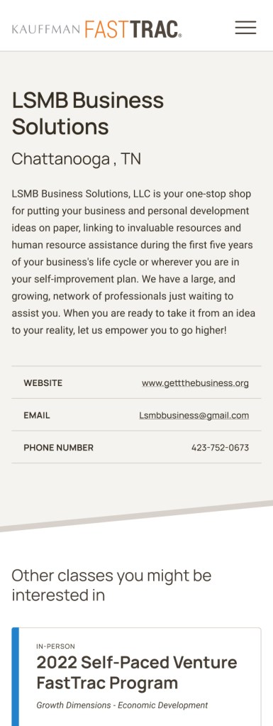
Kauffman offers the FastTrac program in partnership with affiliate partners like educational institutions, small business centers, and libraries. The updated site also helps organizations learn how they can become an affiliate partner and list their course offerings for prospective students.
Kauffman FastTrac was launched by the Ewing Marion Kauffman Foundation in January 1993 and carries out Mr. Kauffman’s belief that everyone has a fundamental right to turn an idea into an economic reality.

Challenges
The FastTrac team wanted to differentiate the experience for each of its audiences: asynchronous, independent learners on FastTrac.org, those taking the course with an affiliate partner, and prospective affiliate partners. They approached Alley to create an attractive and informative storefront-style experience where emerging entrepreneurs could explore courses, select their preferred format (online, hybrid, or in-person), and register for classes — all with an intuitive and seamless user flow.
We were also tasked with improving the editorial experience for Kauffman FastTrac’s internal team. Since we had previously migrated the FastTrac website to WordPress from a different platform in 2018, we were already confident in the security and performance of their CMS. For this iteration, we focused on implementing templates, styles, and other tools that would empower editors to manage content more efficiently — without relying on a developer or designer for support. For example, to eliminate as many manual inputs as possible, we synchronized course and affiliate offerings from FastTrac’s learning and contact management systems and allowed people to sign up directly for courses.
While committed to preserving their established brand guidelines, the Kauffman FastTrac team wanted to improve the overall look and feel of their site. Namely, they wanted a design that felt more approachable and inclusive to more accurately reflect the diversity of the entrepreneurs they support. In addition to an enhanced aesthetic, the FastTrac team wanted to leverage design elements and secondary colors that could aid navigation and provide a more accessible user experience (UX) across the board.
before
after

Solutions
With regard to UX, we improved the FastTrac experience for two key audiences: emerging entrepreneurs and potential affiliate partners. To start, we designed and implemented two distinct user flows that led each group into their respective audience-focused section.
For entrepreneurs, we mapped a new architecture that makes it possible to browse courses without having to register first, as they did in the prior workflow. Meanwhile, carefully worded CTAs, such as “enroll now” or “find a class” mean users can more easily navigate the site and anticipate next steps — especially those with disabilities who rely on screen readers and other accessibility tools.
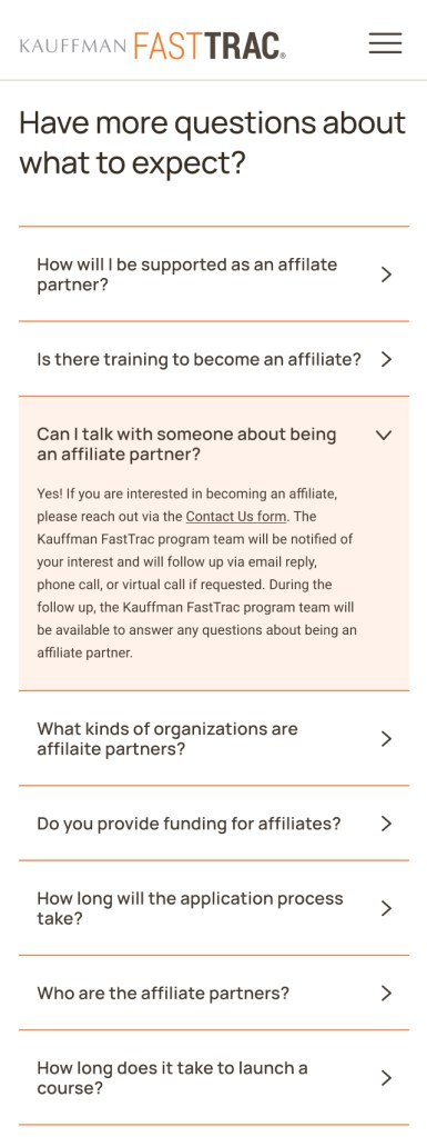
We prioritized a FAQ section to ensure users can easily evaluate the program. Our implementation enables the FastTrac team to quickly make updates to this reusable component, ensuring swift delivery of FastTrac’s latest and most critical information.
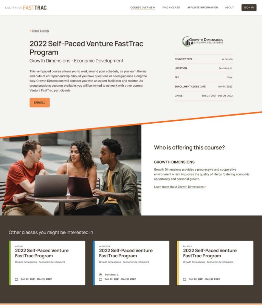
Another area we focused on was the site’s Find a Class section. Our UX team designed a user-friendly layout with card components that present key details for each class. Users can intuitively scan, compare, and assess their options. We also implemented filters to enable tailored searches, allowing users to find courses that meet their specific parameters. Finally, we revamped individual course pages to offer a straightforward description of each class, including all relevant information (such as available formats and locations), along with a clear enrollment process.
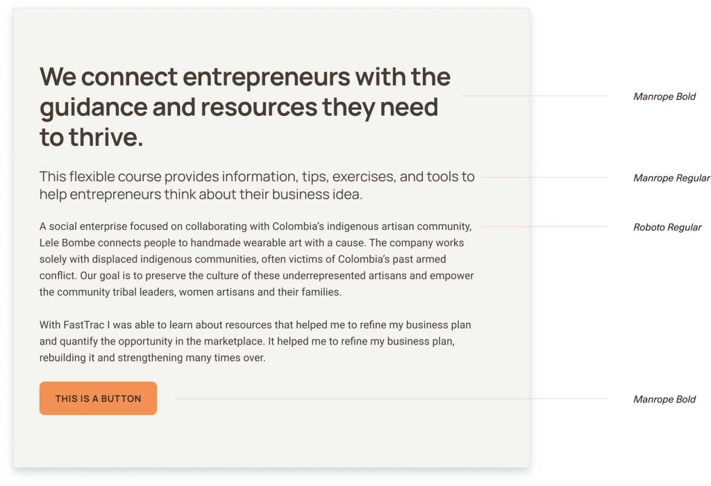
Our improvements to the visual design complimented this new architecture. Using Kauffman FastTrac’s established brand guidelines, we selected a modern, geometric sans-serif font for their typography, added icon elements to enhance usability, and leveraged their brand colors to create a more elevated and consistent aesthetic across all pages — all while maintaining stringent adherence to accessibility standards.
Throughout this project, we used data to guide our work. By integrating Google Analytics, we were able to track user behavior, analyze website performance, and identify areas for improvement. For example, we found that the majority of the original site traffic came from people on desktop or laptop devices, not mobile. This influenced our desktop-first approach throughout the project. This is a reversal of our typical way of working — for many of our clients, their traffic is largely mobile and so we take a mobile-first approach to their design.
Results
The new and improved FastTrac site offers a user-friendly platform that furthers FastTrac’s mission to support aspiring entrepreneurs.
The optimized design, enhanced editorial experience, and improved user flows offer a seamless experience from exploration to enrollment, while maintaining a clear and direct path for organizations to express interest in becoming a FastTrac affiliate.
Let’s talk about how we can put our talents to work for you.