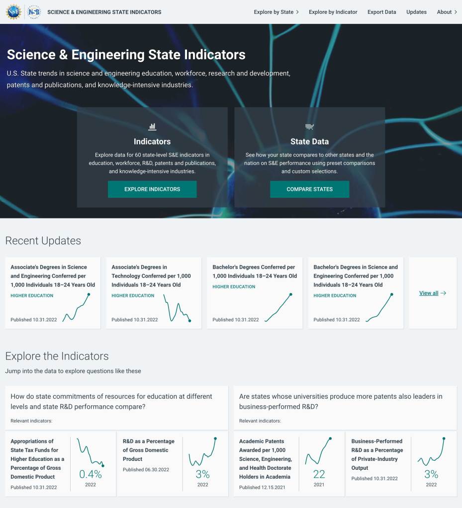
NCSES: Building a highly customizable data exploration experience
Our role
The National Center for Science and Engineering Statistics (NCSES) presents findings on state trends in science and technology education, employed workforce, research and development, patents and publications, and knowledge- and technology-intensive industries. These indicators not only capture how states are performing relative to one another, they also illustrate how policy changes have impacted states that are otherwise similar in size, gross domestic product (GDP), and population. This statistical information informs policy and investment decisions that better position the United States to compete in science and engineering fields.
“These data are intended to contribute to an understanding of the current environment and to inform the development of future policies.”
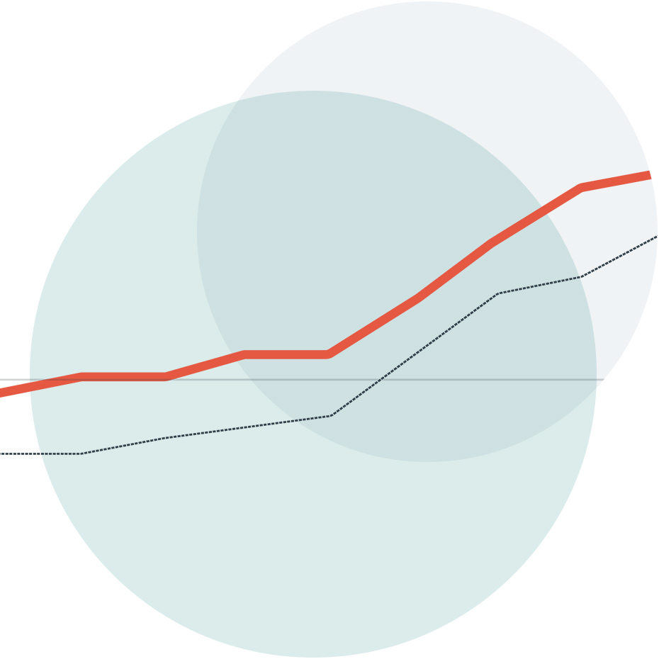
While the existing NCSES site certainly provided access to timely and accurate data, navigating this data felt cumbersome. Small font sizes were difficult to read, non-intuitive charts and histograms made data interpretation challenging, and confusing navigation added friction when selecting and filtering data.
Challenges
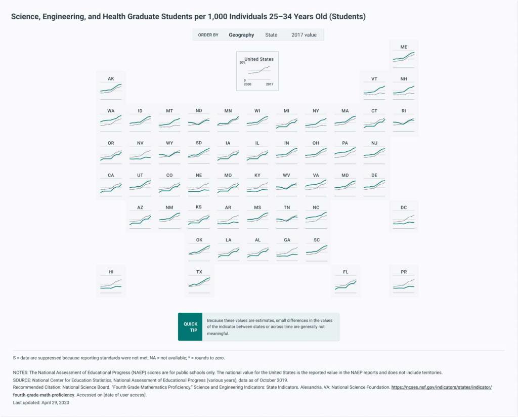
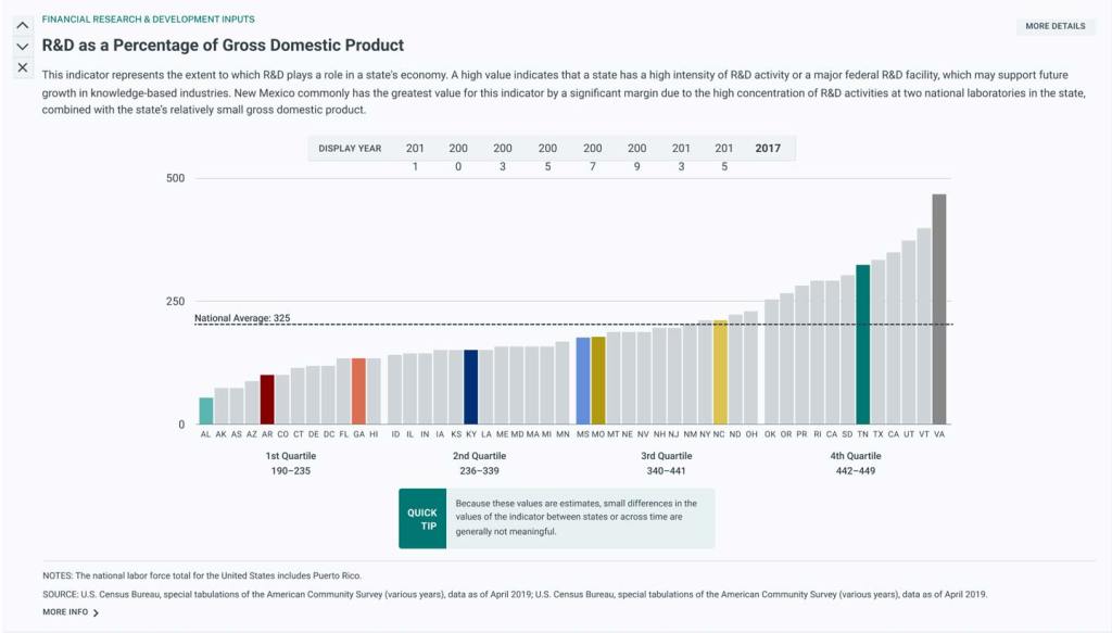
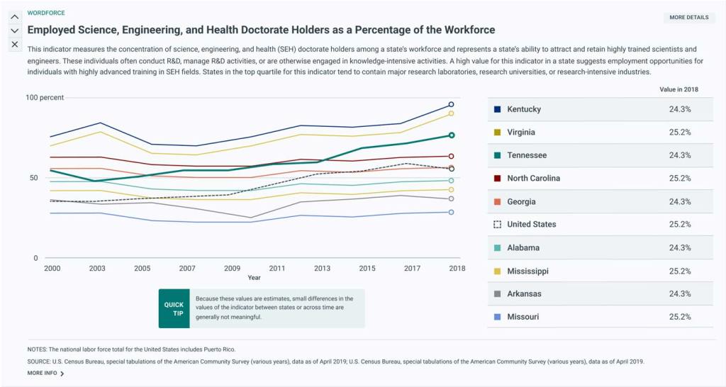
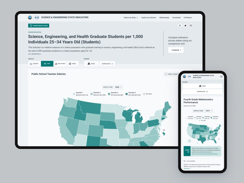
NCSES sought to improve the navigation and presentation of state-level data (over 60 indicators covering more than two decades of information). Their goal wasn’t to merely improve the look and feel of their site, but to provide an experience that empowers their users — policymakers, private industry leaders, and other researchers — to assess the impact of science and technology related initiatives.
NCSES wanted to provide functionality to filter and display data in a highly customizable way, according to users’ specific needs and objectives. And while data analysts certainly frequent the site, the NCSES team also wanted to make sure their data felt accessible to users who may not be as comfortable analyzing and organizing data.

Solutions
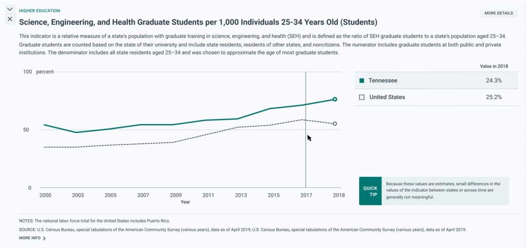
We began our work by diving into the needs, objectives, and behaviors NCSES site users. We formed a panel of representatives across various NCSES audiences and, from there, conducted a series of surveys, emails, and interviews. This user research allowed us to make informed recommendations around which site improvements would have the greatest impact. We found that users ultimately needed the ability to make state-by-state comparisons, print custom reports, and have context around the data presented.
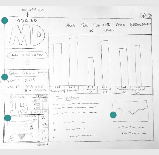
Next, we conducted several internal design studios to sketch out key functionalities, then worked through an iterative wireframing and design phase, which incorporated internal and client feedback.
Design Studio Session

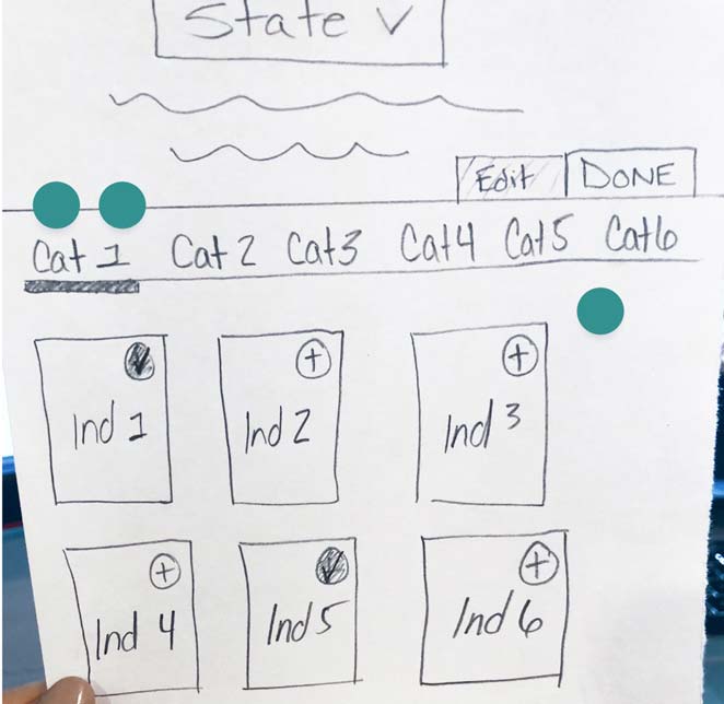
A heatmap exercise using dots was employed to identify functionality from each sketch concept that the group felt best supported the stated user needs.
Our development team then built a custom application in Next.js (an open-source platform) for the new site along with custom functionalities that powered visualizations, charts, and comparisons across the data.
For this project, we forewent a content management system (CMS) and elected to pull all data and documentation through CSV and markdown files. We transformed that source data into JavaScript Object Notation (JSON) files that power the data application programming interface (API). This approach offered a number of benefits:
- The NCSES staff could easily update data on their end and send it to our team, where our developers could publish it to the live site using a largely automated process.
- Using the static export feature of Next.js allowed us to build an exceptionally fast site and API.
- A read-only production site means that potential security threats are virtually eliminated.
- The API is guaranteed to return consistent data as the architecture pre-builds and caches the data (eliminating the process of parsing requests, making database queries, and reformatting the data for each request).
- All API routes are effectively cached on the filesystem, making them super fast to serve, and eliminating the need for a database.
Results
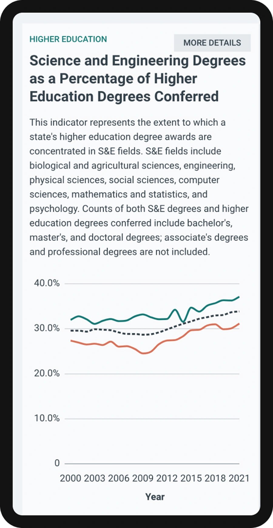
The improvements to the NCSES site resulted in an interface that empowers users to discover and interpret data in a more meaningful way. Their site boasts a variety of presentation styles that make data accessible to various audiences with vastly different needs and objectives. With the ability to display and export data in a highly customizable way (line graphs, charts, tables, or interactive maps) and compare specific state-by-state indicators, the NCSES site now facilitates a productive experience for policymakers, researchers, and industry leaders alike.
Do you want to build a custom experience for your site? Let’s chat.

Let’s talk about how we can put our talents to work for you.