
A midwest makeover: Relaunching Wisconsin Public Radio
Our role

Wisconsin Public Radio (WPR) began broadcasting to the public in 1917 as “9XM” from the University of Wisconsin. The station sat at the forefront of radio’s spread, using exciting new technology to reach people with weather information. Through the decades, as technology matured, so has WPR grown. Today, 39 stations inform and inspire thousands of listeners across Wisconsin through news, music, conversation, events, and special projects.
To continue serving Wisconsinites, WPR recently launched changes to its services to make it easier for listeners to find news and music. In planning for these changes, WPR leadership felt the time was right to reexamine the effectiveness of their online platform, wpr.org. That’s when they turned to Alley as their partner in this endeavor.
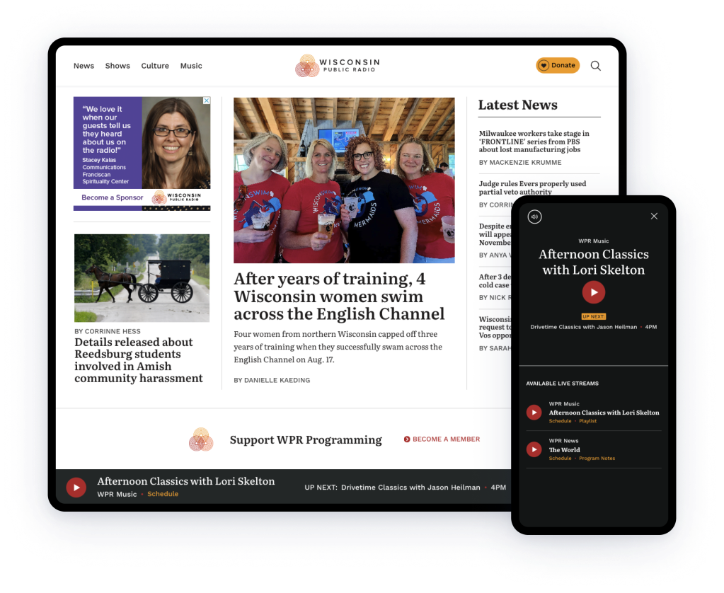
Challenges
When Alley began working with WPR, their team was struggling with an outdated Drupal CMS. The admin interface was frustratingly slow and confusing to work with. Their team needed a better editing experience that would move them from story pitch to publish faster.
External users were also in a pickle. The site’s design and UX were outdated and confusing. The site lacked a persistent audio player, a common feature across WPR’s contemporaries in public radio.
WPR’s “Find a Station” feature was organized according to broad regions rather than narrower locales that a user could quickly recognize as their location. This was a particular problem as WPR wanted to focus more on local news.
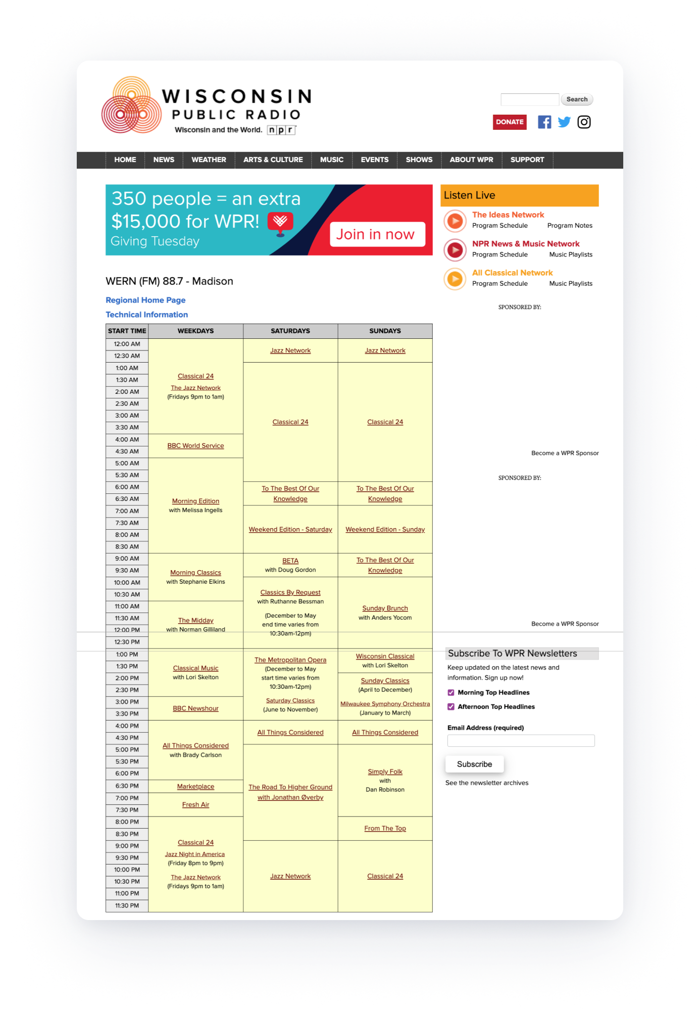
Before

After

Solutions
Find a station
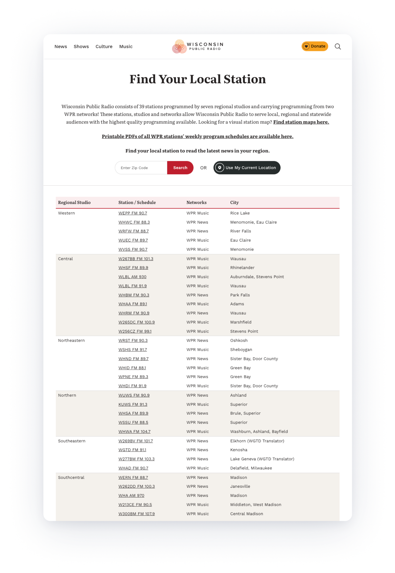
To assist users in quickly finding their station, we introduced a prominent “Find Your Local Station” module on the site’s homepage. Users can enter their zip code or, through location services, click to identify the closest station(s) to which they can then link. As some stations overlap in their signal reach, we programmed the feature to calculate the overland distance between two points on the globe. In that way, the user will see all the stations that can broadcast to their location.
Prior to the redesign, station pages were station rather than user-centric. Landing pages were dominated by unsightly grids that displayed scheduled programming, leaving little room for other content. Today, the UX of these pages is local news first and provides users with highly visible links to schedules, staff, and technical information. Behind the scenes, we established links among stations, schedules, and regional stories. As a result, users can now find a variety of local content in one place on each station page.
The new website is beautiful, functional, and enables us to do what we need to today and well into the future. The mobile experience is tremendous, which is great because a majority of our audience is engaging with our site on a mobile device. The code is well documented and the documentation about the building blocks of the site has been very helpful. The persistent player has impressed several web developers in terms of how it was built and how it functions.
— Noah Ovshinsky, News Director, Wisconsin Public Radio
Before
After
Persistent audio player
For a persistent audio player to be successful, users must have consistent audio without a second of interruption. To achieve this, we took an “html over the wire” approach where we custom built the player as a thin JavaScript layer that stays in place as the user navigates to other pages or interacts with site features. When a user clicks an internal link, rather than the entire page reloading, this JavaScript code fetches the HTML for the page the user requested and swaps the content the user sees for the content on the new page without any interruption in audio playback. In this way we delivered the functionality WPR needed without building the entire site in JavaScript, which would have been hard for WPR to maintain.
Forms
WPR has a number of forms across the site, such as sign-up forms for newsletters. We wanted WPR to be able to build and change these forms directly in WordPress without the assistance of a developer. To do this, we installed the Gravity Forms plugin, which would collect data such as name and email and deliver it to WPR’s CRM. For WPR’s editors, they can easily make changes to a form that fan out across the site wherever that form is present, saving time and effort.
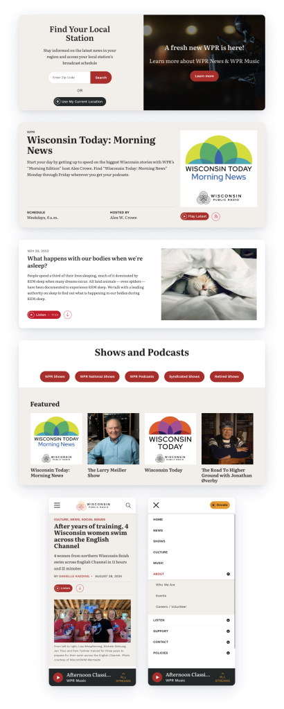
Design
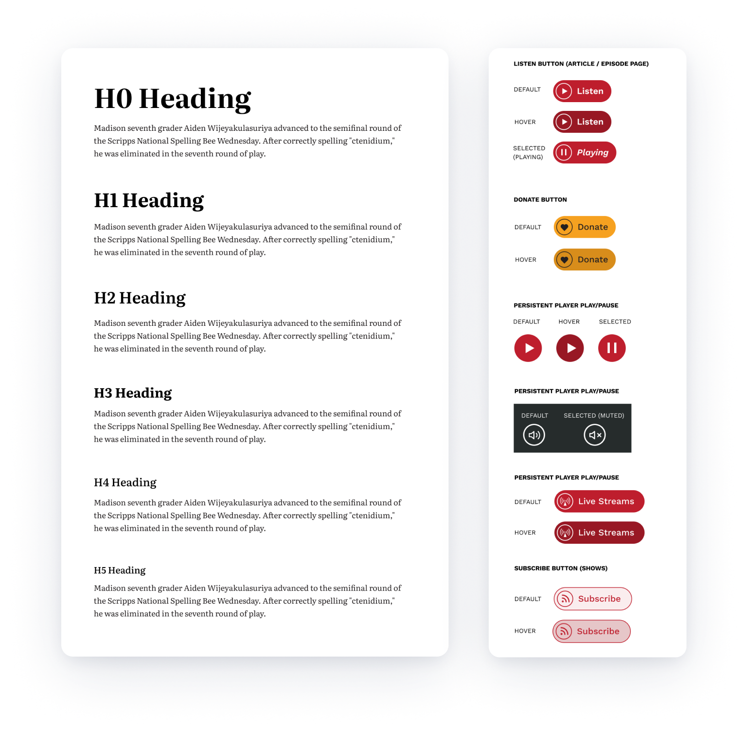
Our objective regarding look and feel was to modernize the WPR site, which appeared dated and was not optimized for mobile. Using WPR’s existing logo and color scheme as a starting point, we proposed fresh accent colors, new highly readable fonts, and an array of new styles for links, buttons, and story metadata. We introduced more immersive imagery and white space to promote easy scanning.
The design system was crafted not only with external visitors in mind, but also with WPR’s internal team. WPR now has more on brand, eye-catching styles that they can quickly apply to ads for internal initiatives.FormsWPR has a number of forms across the site, such as sign-up forms for newsletters. We wanted WPR to be able to build and change these forms directly in WordPress without the assistance of a developer. To do this, we installed the Gravity Forms plugin, which would collect data such as name and email and deliver it to WPR’s CRM. WPR’s editors can easily make changes to a form that fans out across the site wherever that form is present, saving time and effort.
Information Architecture
When it came to the site’s navigation, our objective was to rework the way information is structured and located based on how visitors seek information, not how WPR is organized internally. One way we did this was by reducing the number of primary navigation choices in the header from 15 (including social media links) down to seven selections on the new site. We moved utility navigation and social links to the footer. Our approach was “navigation as you need it;” after users clicked into a section, they would then see additional links to sub-sections.
Results
Together with WPR, we met our project goals. WPR listeners now enjoy a faster, more navigable site and a persistent audio player that fits seamlessly into the site. These benefits are felt especially on mobile. Internally, WPR editors are saving time through the new WordPress CMS.
Let’s talk about how we can put our talents to work for you.
